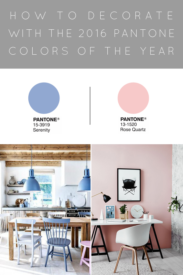
Pantone’s being tricky this year and announced not one but TWO colors of the year; Rose Quartz and Serenity. I have to admit, seeing them together I immediately thought of a gender reveal party. Am I right?? Lighter shades of pink and blue will forever be associated with the colors of newborn babies, but there had to be some method behind their madness.
The more I started looking at these two colors and how you can use them in your home, the more I liked them…but not together. They definitely aren’t for everyone, and I can definitely see myself leaning towards using the Rose Quartz over the Serenity more. I think they’re also colors that need to be used in moderation and shouldn’t be overdone. So let’s take a look at how you can incorporate these colors into your home without making you think of babies.
ROSE QUARTZ
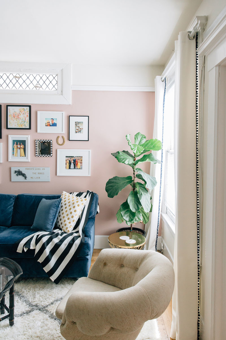
A Pop of Paint
Why it works: The subtle blush of this pink wall compliments the light and airy feel of this room without being too dramatic. The blue velvet couch pops perfectly against the wall. [source]

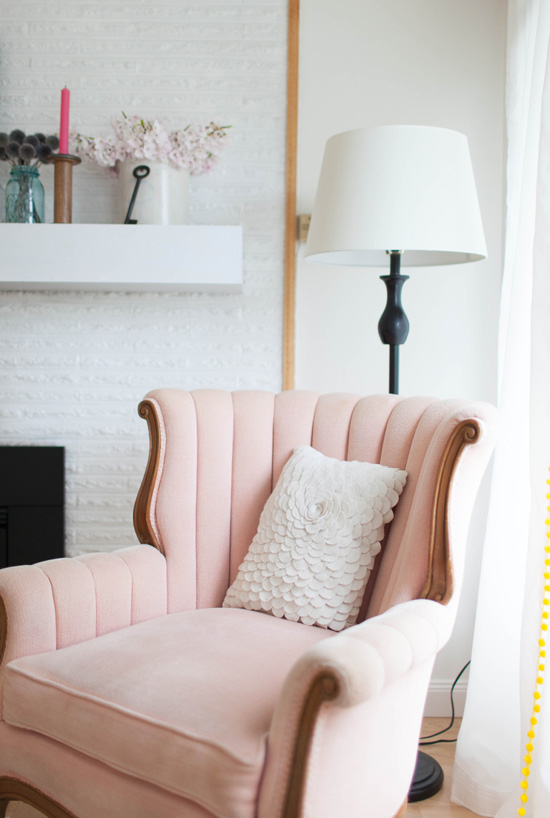
Upholstery
Why it works: The beautiful feminine curves of this chair need an equally feminine color to compliment it. Paired with the white walls and white accents, nothing in this space feels overpowering. [source]
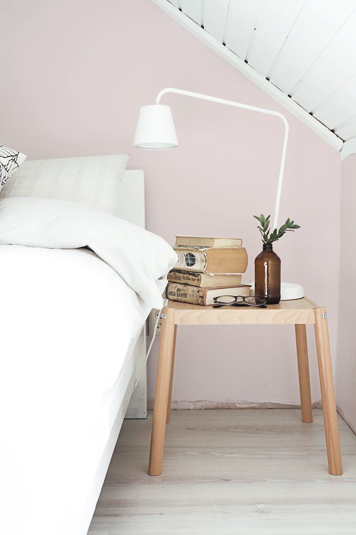
A Pop of Paint (again)
Why it works: Another example of a simple accent wall in a pretty pale pink. With the raw wood and white accents, this scandinavian look feels very balanced. [source]
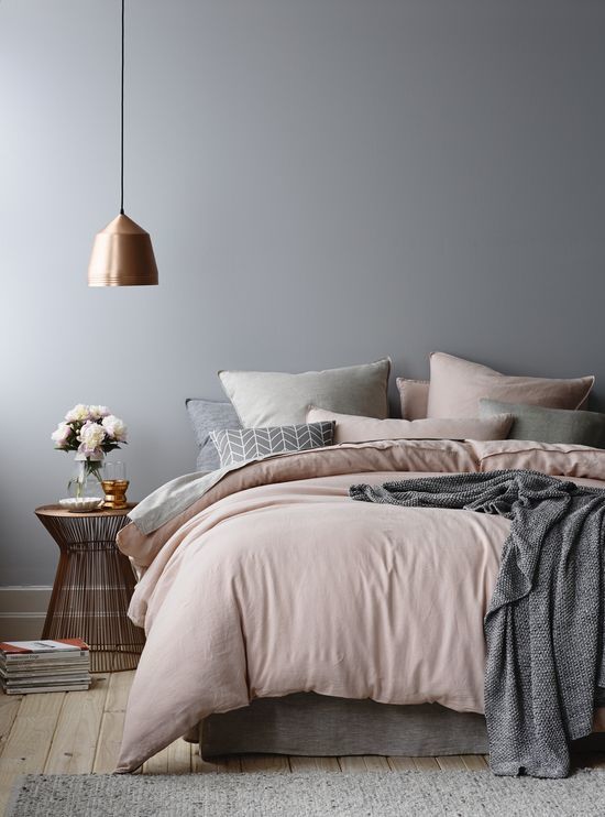
Bedding
Why it works: Does this not look like the coziest bed? Everything about this picture is perfect. The gray is just dark enough to let the pink stand out yet still keeps it muted. Add in the copper accents for a little more warmth to complete the look. [source]
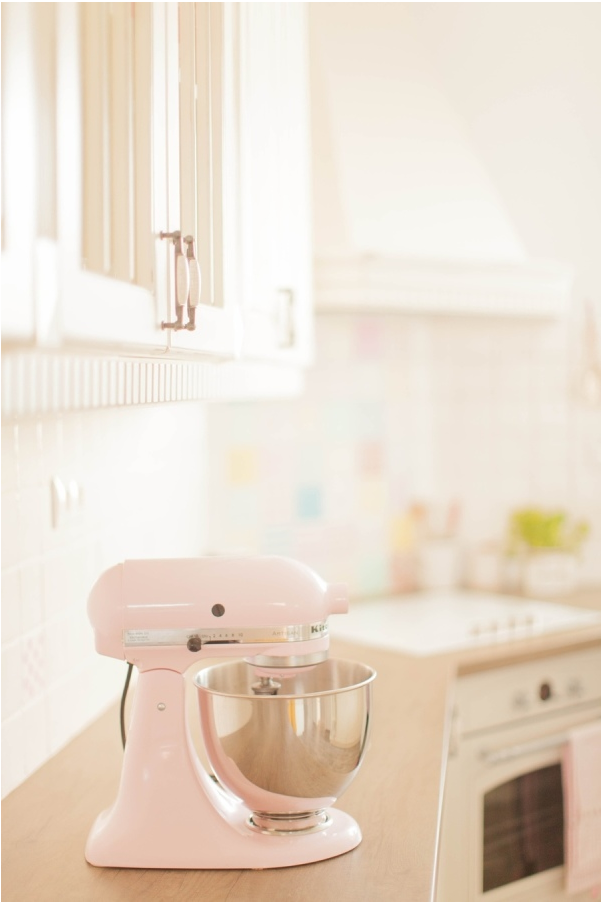
Kitchen Accessories
Why it works: If you don’t want to fully commit to Rose Quartz, a little pop here and there is a great way to still incorporate it into your home. Along with kitchen appliances, try using plates or bowls. [source]
Serenity
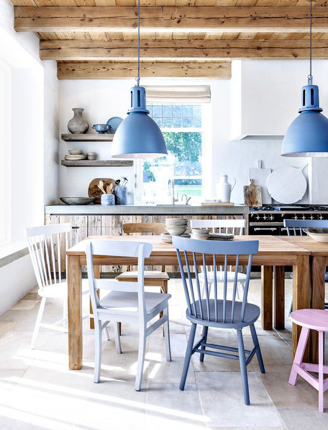
Pendant Lights
Why it works: With so many neutrals in this space, the lights add that perfect contrast of color without overdoing it. [source]
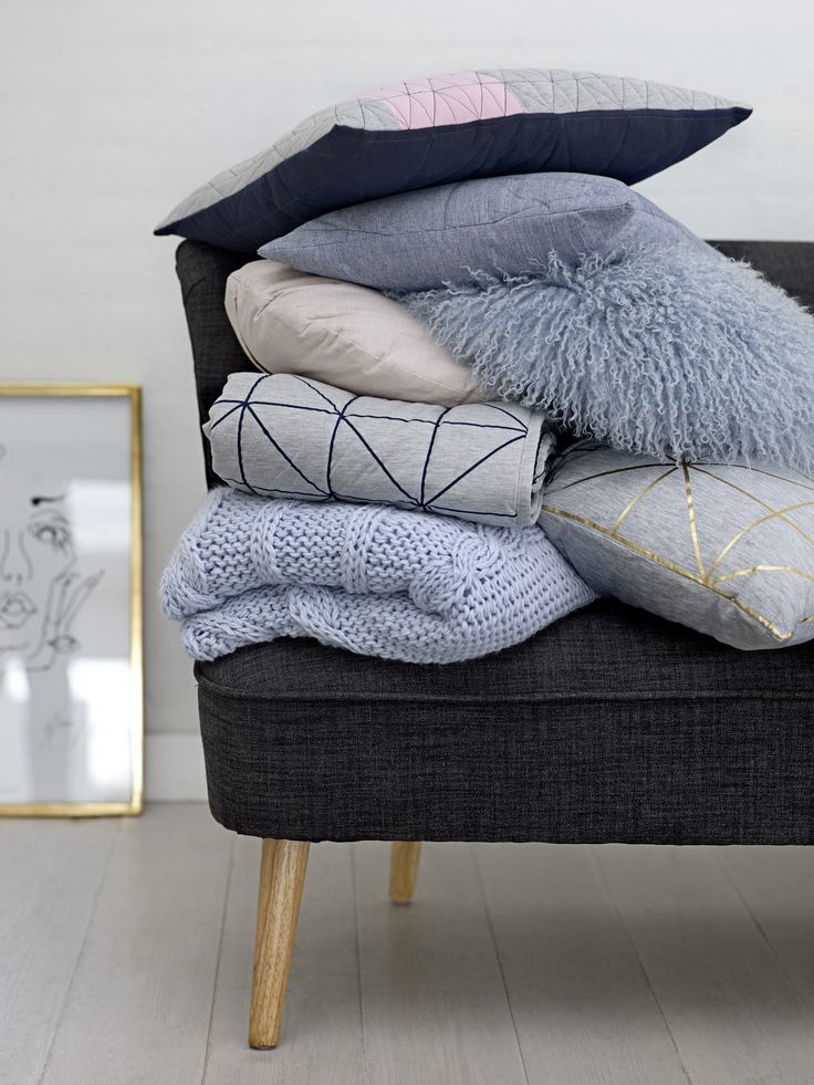
Pillows
Why it works: Pillows are the easiest way to change up the color/style in your home. Use a few different shades and textures of blue to spice things up. [source]
Paint
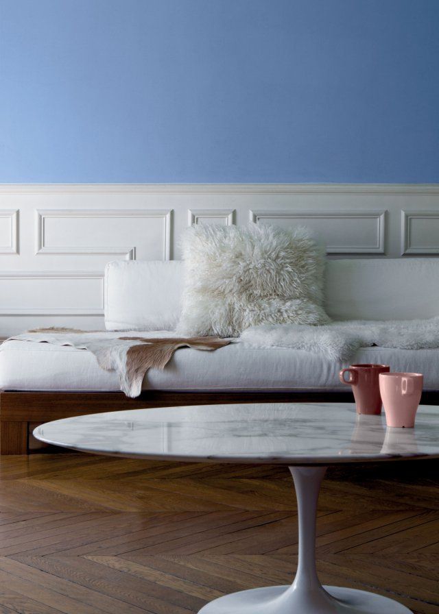
Why it works: A bold wall paired with neutral accessories is always a good combo. They balance one another well, while letting the blue be the main attraction. [source]
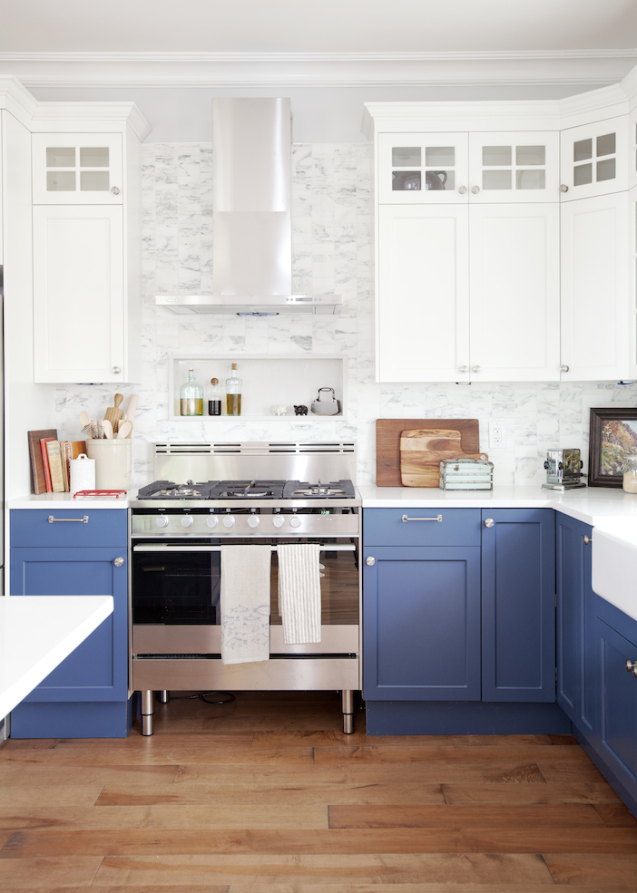
Kitchen Cabinets
Why it works: The two toned cabinetry here is what makes this space work. If the uppers were blue as well, it would feel too dark and heavy. The split of white on top and blue on the bottom is the perfect balance. [source]
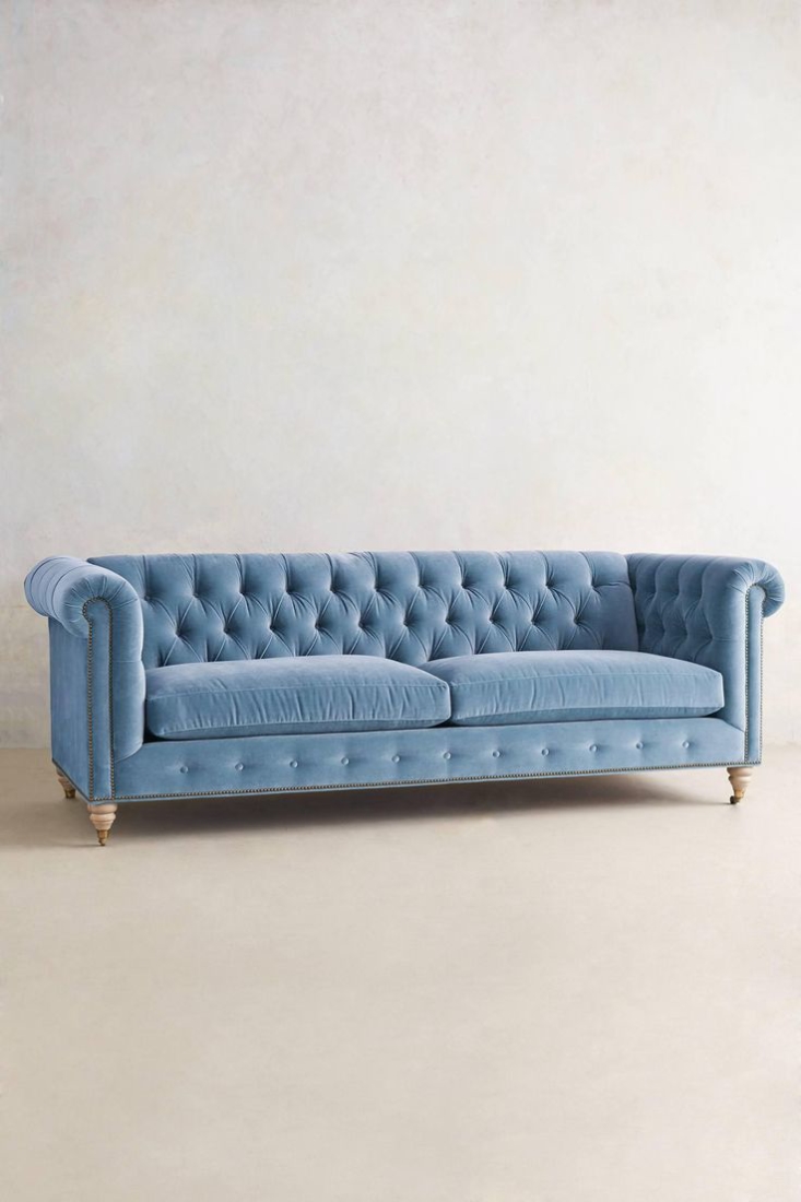
Upholstery
Why it works: In the right space, this couch would be perfect. It’s definitely a show stopper on it’s own with all that gorgeous tufting. Pair it with neutrals and soft colors to let it stand out. [source]
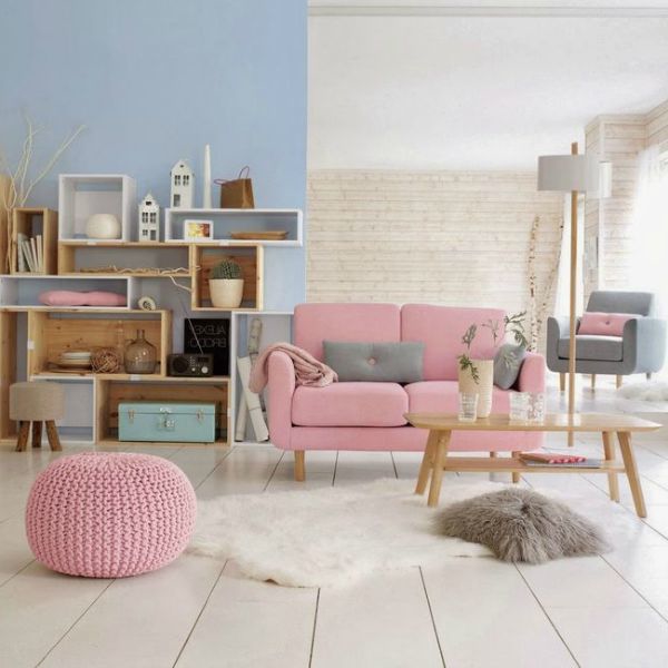
Together
Nope. Sorry. Just not feeling these colors together. I love them apart, but together they just don’t do it for me. I think it’s mainly because they both carry the same weight. I prefer more of a contrast, like a lighter pink with a navy blue. It was hard to find these two photos, and even the second one is slightly different shades of these colors. I think that’s proof that they just aren’t meant to be together. [source 1, 2]
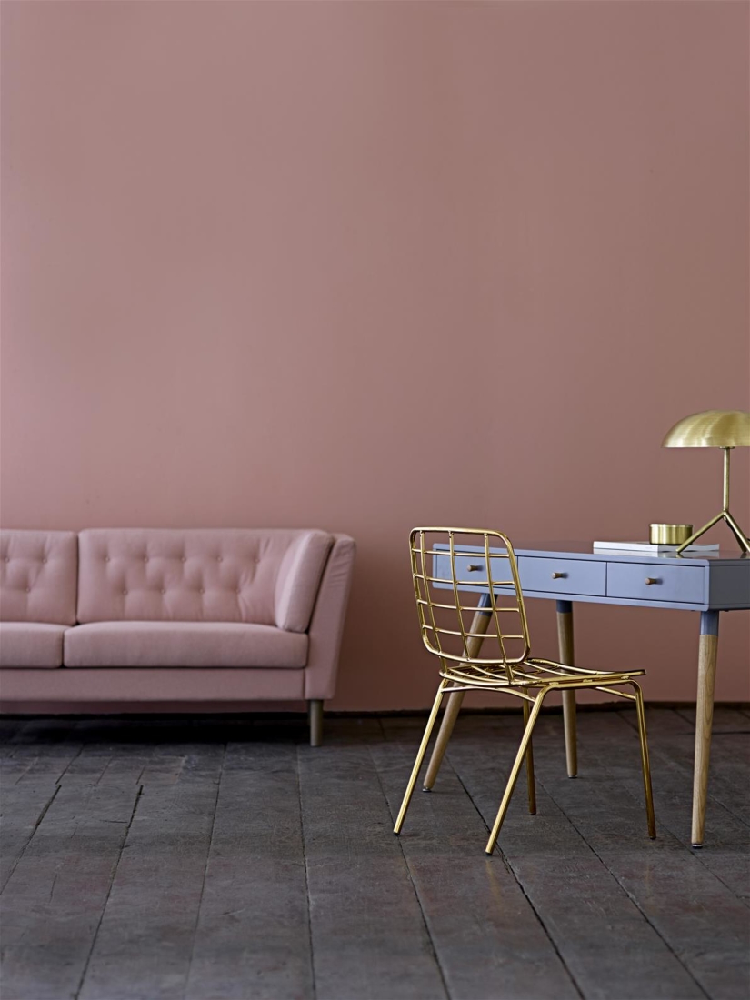
So what do you think? Are you a fan of Rose Quartz and Serenity? How do you feel about them apart? Together?
I can totally see myself rocking some Rose Quartz this year. Serenity…maybe not so much.




Kensington Design
Loved all the colours. Thank you. We are surprised to see that we are featured here!
Finola wall
Loved all the colours. I have dark furniture in our dining room with light timber floors. At the moment we have terracotta colour and I’m anxious to change it,any advice,please.
joy
Rose Quartz yes. Serenity not so much. Certainly not together. I may use the rose quartz with gray and then something bright to prevent dullness overload…
Pat M.
Of all the colors in the spectrum, why these two? Even if they wanted to go “pastel” there are others much more useful for decorating. Oh well, there’s always next year.