Ah it feels good to have a productive weekend. I got lots of blog projects done, finally put my winter clothes away, and did lots of snuggling with Oaks and Netflix watching. Any Orange is the New Black Fans Out There?? And now it’s Monday, boo.
Something I did the other week was update my backdrop. If you follow me on Facebook or Instagram, you might have seen a little sneak peak. When I first made it last year, I gave it a weathered look using some stain and a whitewash. It became pretty recognizable as part of my brand which I loved, but I always felt that it made my photos feel a little dark.
[See the full tutorial HERE.]
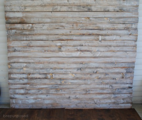
I’ve always been a fan of photos against a clean, white background and decided to give this guy a new look. I had a little can of Valspar’s Pure White on hand and grabbed a large paint brush and went to town.
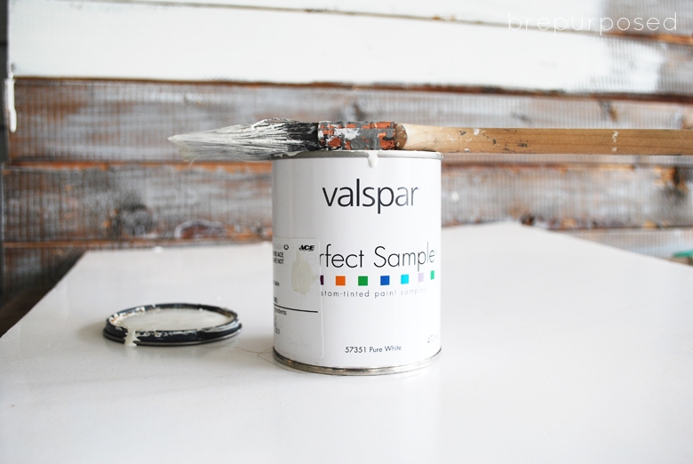
After two quick coats I was finished.
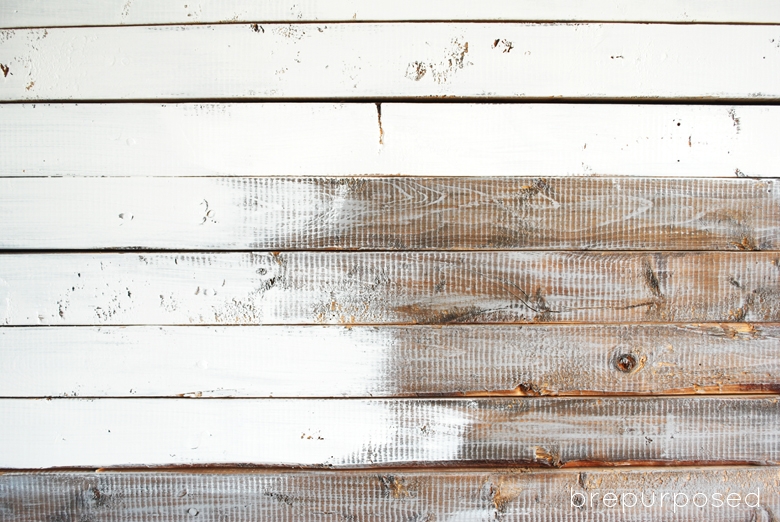
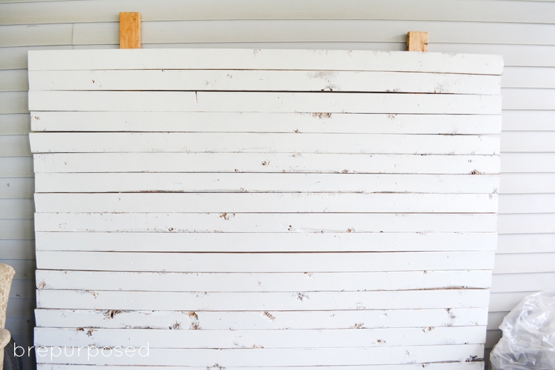
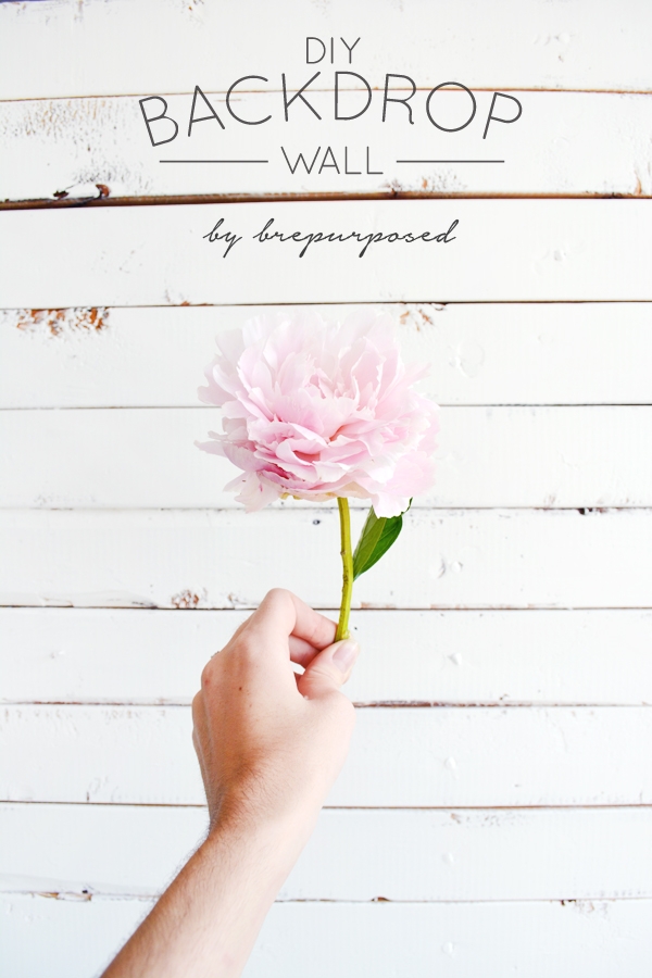
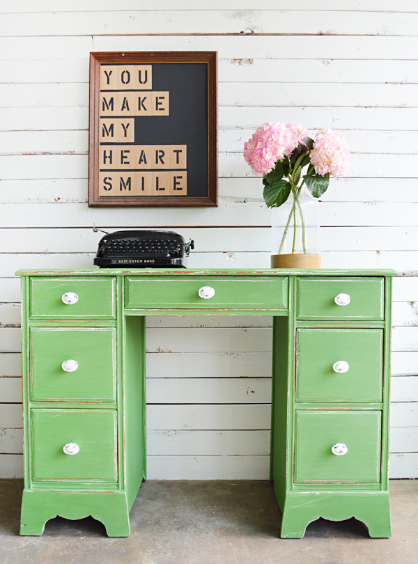
I love that you can still see the grain and texture of the wood and it still has some character to it. I’ve already used it on a couple projects and am loving the way it looks.

What do you think?? Would you have kept it the way it originally was? Bloggers: what do you use as your backdrop?
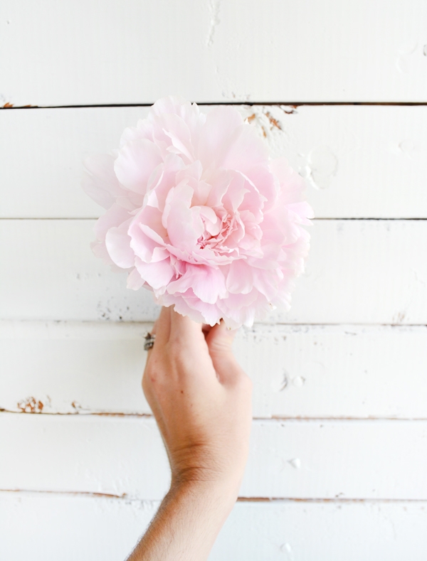
P.S. I may or may not have stolen that peony from a random yard when I was taking oaks for a walk 😉
Have a fab day!





Kerry
I think they both have their good qualities! Grey is my favorite color so I am sort of partial to that, but I think the white will make the colors of your furniture pieces pop more. And change is always good. Currently still deciding on what to use for my backdrop. By the way, do you usually shoot indoors or outside? Your lighting is great.
brepurposed
I really loved the grey but the white was a nice way to change things up! And I keep my backdrop outside on our covered porch, so I’m always shooting in natural light which definitely helps!
Corinna - For My Love Of
I like the white better! I don’t blog about much that requires a backdrop. I have been playing around with the idea of painting a section of our brick exterior white those for those moments when a backdrop would help. Not sure if it’s worth it though.
brepurposed
Thanks Corinna! It’s pretty much a necessity for me because we live in a tiny apartment with terrible lighting. I think it would be definitely worth it to paint that brick, I bet it would look so cool!
Erin
I’m a fan! Your back drop looks so much like my garden room wall – which is now my new photo spot 🙂 Not much beats the white ship lap, eh?
brepurposed
Thanks Erin! Definitely can’t go wrong with the ship lap look!
Marie@The Interior Frugalista
I agree Bre, there is something about a white background that makes everything pop. I like how your painted backdrop has maintained it’s rustic charm. To answer your question…my backdrop is a light weight 1″x 2″ frame covered with hardboard and papered with paintable bead board wallpaper painted white.
brepurposed
Thanks Marie! I’m excited to see how it helps my photos! And thanks for sharing! I’m also interested to hear how other bloggers operate 🙂
Jenny @ Refresh Living
I love the white, and the way the rustic elements of the wood show through is perfect. It’s at the top of my to-do list to finally create a background for my large pieces. I think I’m doing a white plank, so it’ll look similar to yours now! Your pieces will look create against it (I can’t wait to see that tavern green piece this week!!) I don’t know if you saw, but Pocketful of Posies and I started a new link party. It’s on Tuesdays at 7 CST. I would love, love for you to come link up with us!
brepurposed
Thanks Jenny! And yay, I can’t wait to see yours, I know it will turn out great! And I will most definitely swing by and link up tomorrow; thanks for the heads up!
cassie @ primitive & proper
i love this! i think i need to make one!
brepurposed
Thanks Cassie! You totally should, I love having it!
Kristi
LOVE the white Bre! I agree totally! The old one was great and very recognizable, but there’s just something about light & bright white!
brepurposed
Thanks Kristi!! I just love the clean, fresh look that the white gives it!
Gilly @ Colour Saturated Life
Loving the new look, I am always one for changing things up and this looks beautiful! Can’t wait to see a furniture piece against this wall!
brepurposed
Thanks Gilly! I needed a little change 🙂 And I’ll be sharing a furniture makeover on Wednesday! I already love how the pictures are turning out 🙂