ROMAN CLAY BATHROOM REVEAL
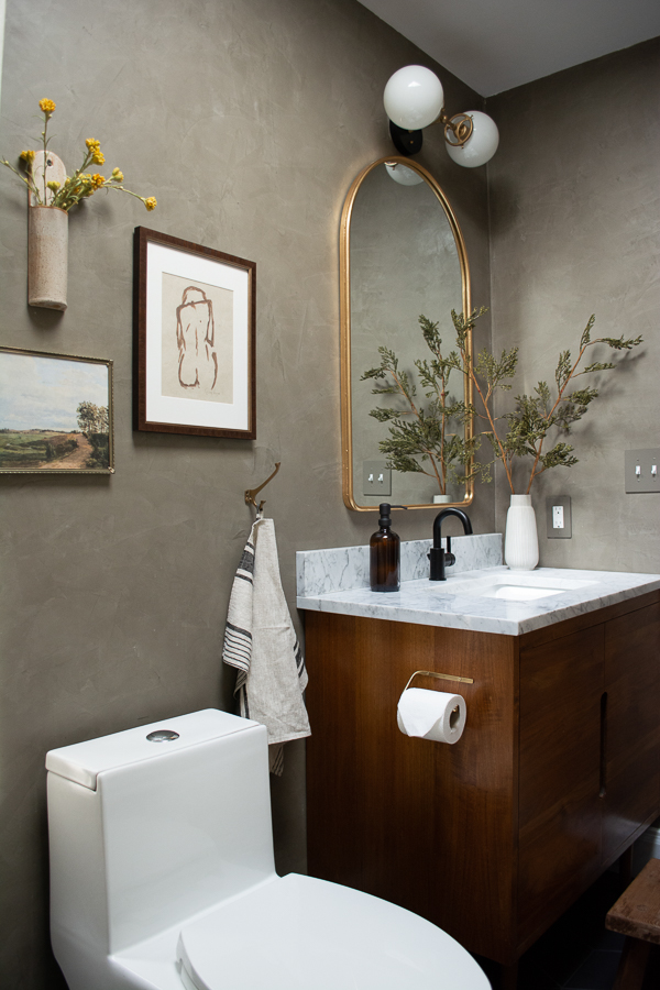
Ahh it’s finally time to reveal this bathroom! It’s been quite a long road with lots of hiccups but our new Roman Clay Kids and Guest Bathroom is DONE! I can’t wait to share it with you!
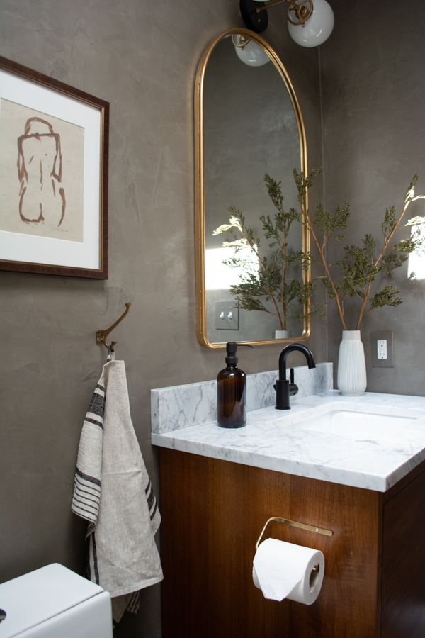
I’m totally obsessed. And yes it’s the fanciest kids bathroom ever but I’m a huge advocate of designing your home to fit your style. Things can still be pretty AND functional.
Before we dive into all the beauty shots, let’s take a walk down memory lane and remember where we started.
THE BEFORES
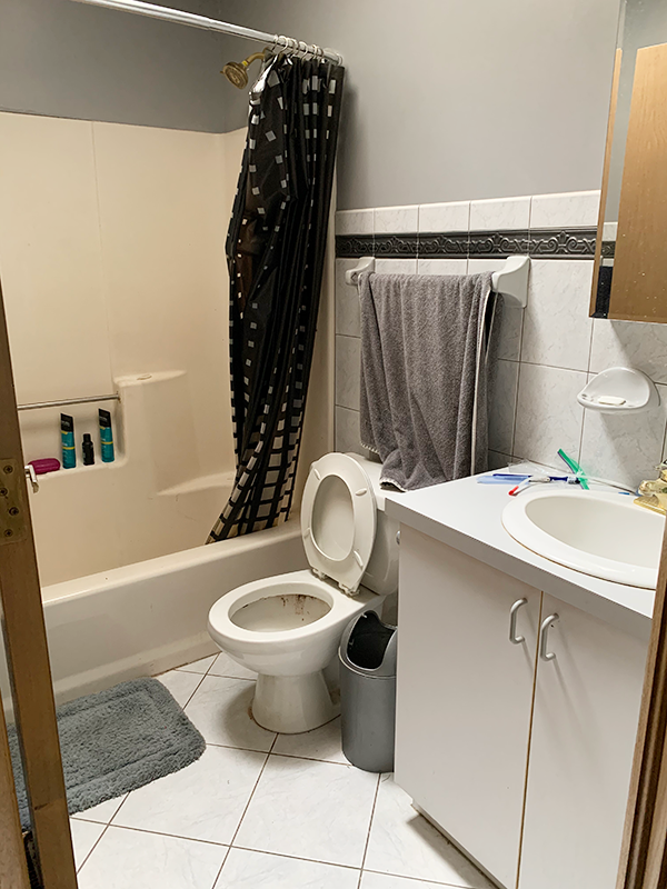
It was old and gross and stinky and in desperate need of an update!
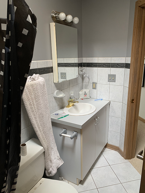
We did most of the work ourselves minus some plumbing, drywall and pocket door install. We started demo back in early May and just wrapped it up now in mid July. Proof that things don’t always happen overnight around here.
It’s the smallest room in our house and ironically seemed to take SO LONG. But that’s just how DIY renos go. You never know what’s going to happen until you start!
Now let’s get to the fun stuff 🙂
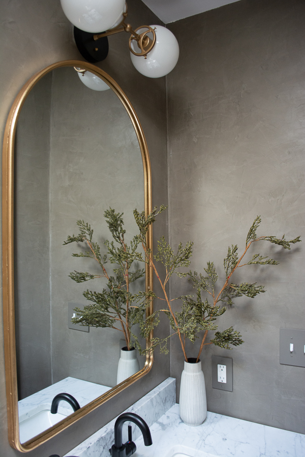
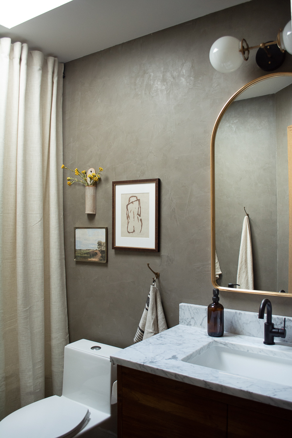
I got hooked on roman clay when I did the fireplace makeover in the kid’s play room. When I was planning out the design for this bathroom, I was struggling with what to do with the walls outside the shower.
Paint? Tile? Bead board? Nothing was feeling quite right. And then I thought about Roman Clay and how cool that would look. Especially since it’s a small room and it wouldn’t be TOO much work.
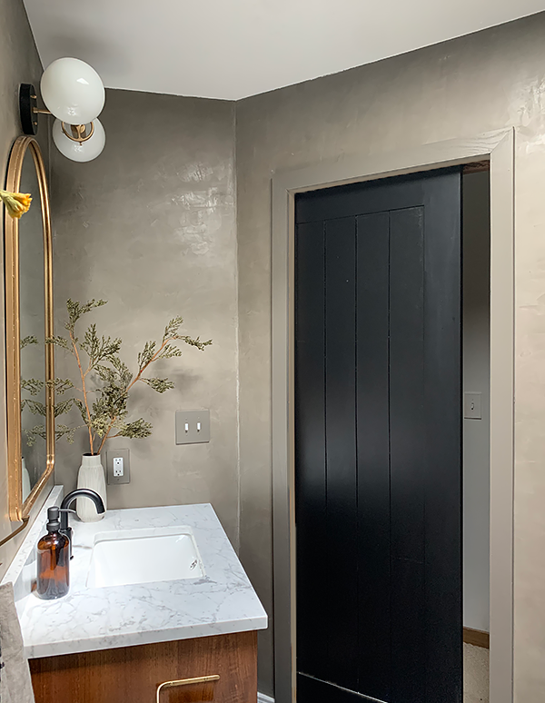
I ordered it from Portola Paints again and used the color Guru. I talked to people who have used it in bathrooms and they all said it held up find to moisture. I made sure to seal it twice with their top coat though.
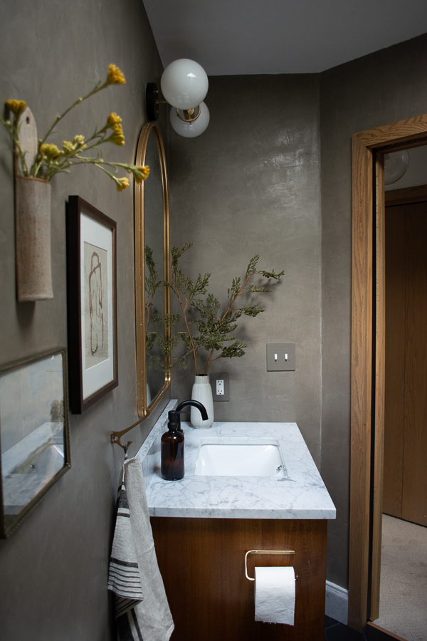
I just love the texture it adds in here. I was a little worried about using a darker color in such a small room, but I think it’s so perfect and created the perfect backdrop for all the other pieces.
Let’s chat about the vanity/sink area first!
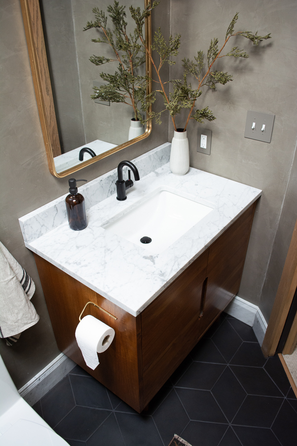
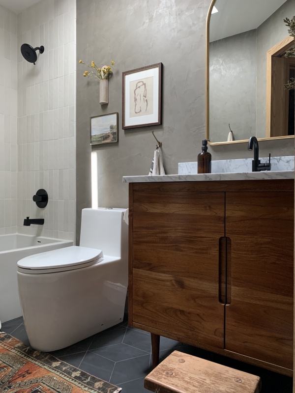
We got the Bivens Teak Vanity from Signature Hardware. It’s the perfect modern piece – but I wasn’t in love with the color of the teak. So I ended up staining it using Watco Danish Oil in Dark Walnut. This color fits in much better with the rest of our home and the look I was going for.
The really nice thing about this vanity is that it comes with the countertop and sink. There are different options you can choose and I ended up going with Carrara marble and a rectangular under-mount sink.
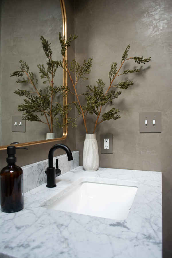
I paired it with the Precept Single Handle Bathroom Faucet in Matte Black. I love how simple and modern it is and I figure one little handle to turn the water on and off is easier to keep clean than two 😉
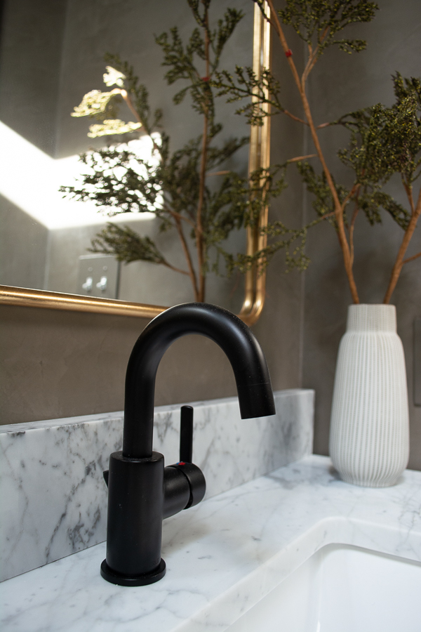
I knew I wanted an arched mirror from the beginning and love how big this one is. It’s definitely big and oversized but I love it!
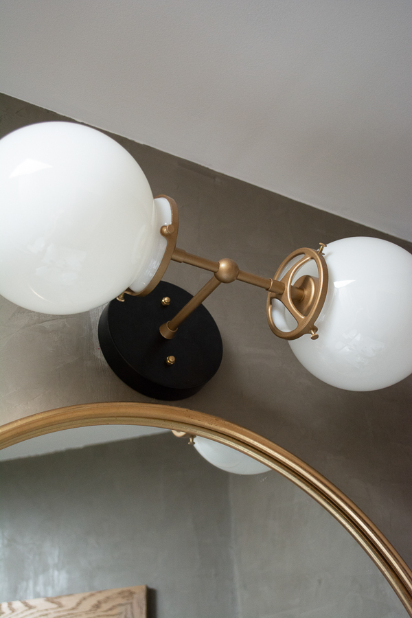
The light took me a little longer to decide on. I wanted to make sure my ratio of black and brass in here felt right and wasn’t unbalanced. So I ended up going with something that was brass and black ha. I’ve ordered from this Etsy shop before and love their modern fixtures.
The roundness of the globes brings some nice curves into the space and the detail of the arms is just so good!
Ok moving over to the toilet area!
Can I just say – I’m never buying another kind of toilet again. It seems silly, but those straight sides are a GAME CHANGER. It’s SO much easier to clean which I know I will appreciate even more once the kids start using it more and more.
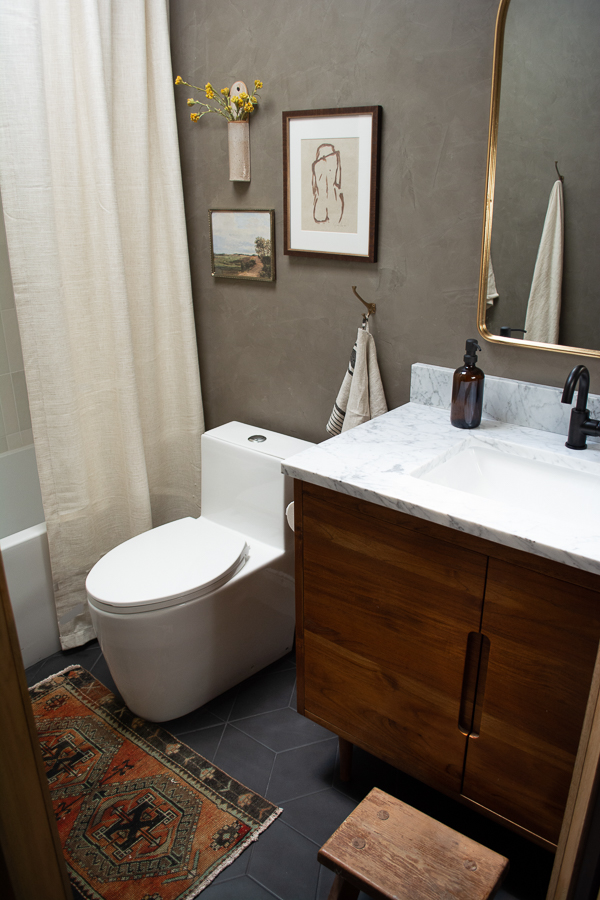
I debated between shelves and a gallery wall above the toilet and ended up going with a gallery wall because it just seemed to fit the vibe of this space better. There is plenty of storage in the vanity and I probably just would have put pretty things on the shelves anyway and not anything super practical.
Keeping that wall space simple and not cluttering it up feels like the right choice.
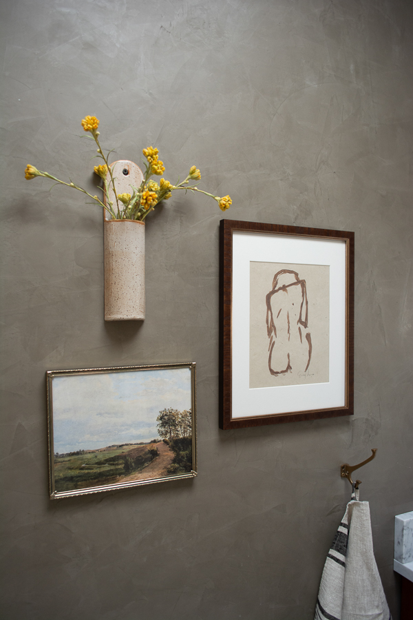
The nudey print I already had from Emily Ruth Design. I bought the little vintage landscape as a downloadable print on Etsy and I’m obsessed with that ceramic vase I got from SAMLEEHELLO.
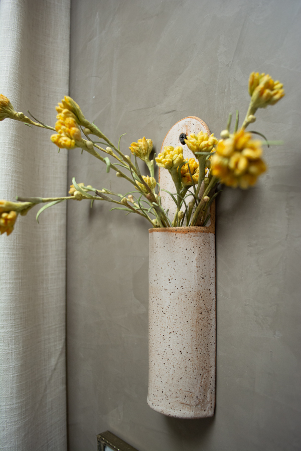
Moving into the shower!
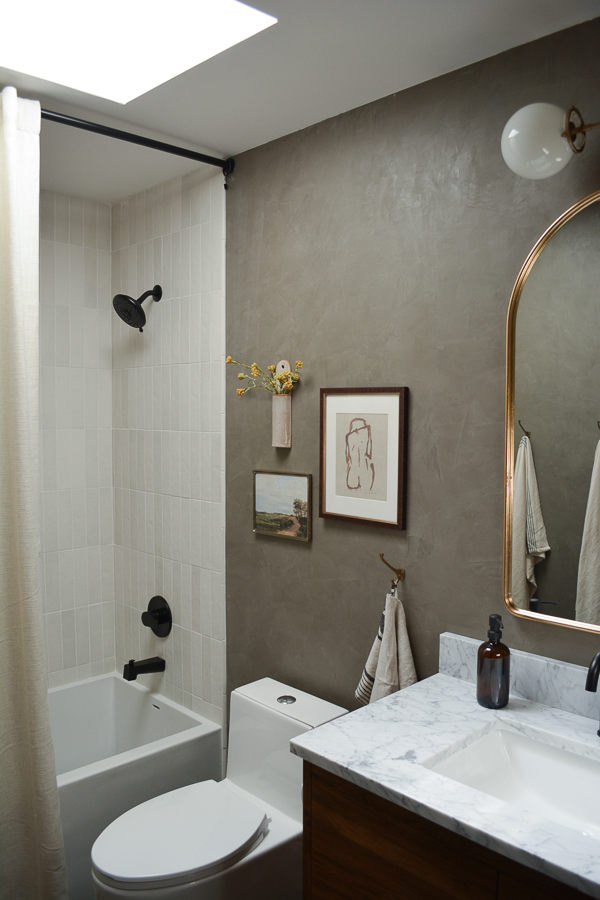
I bought regular window curtains because I wanted the floor to ceiling look and couldn’t find any long ones I loved. I ended up using two panels so that I can pull them both to one side or split them for a more sophisticated look.
Using some curtain rings with little hooks, I attached a liner that I cut in half so it can also be pulled to either side. I may end up adding some magnets or velcro if I don’t like the way it functions but for now it seems pretty good!
The tile we used in the shower is the Makoto Matte Ceramic Wall Tile in Shoji White by Bedrosians. I played around with some other tile patterns but ultimately decided on a classic vertical stack. I like the simplicity. And love how there is some variation to these tiles and they aren’t all the same exact color.
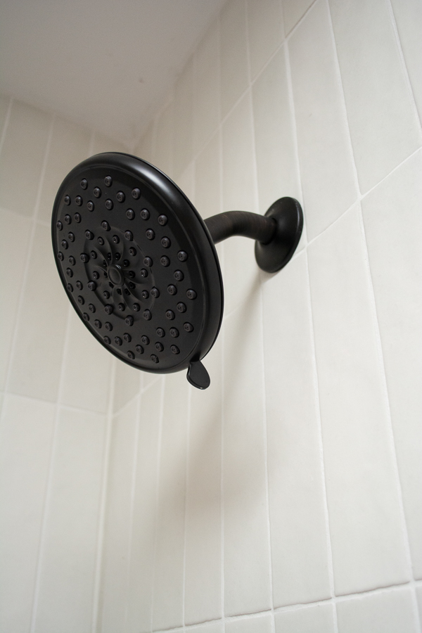
I kept the fixtures the same in the shower using the Peerless Xander Tub and Shower Trim Kit in Matte Black. Simple and perfect against the white tiles.
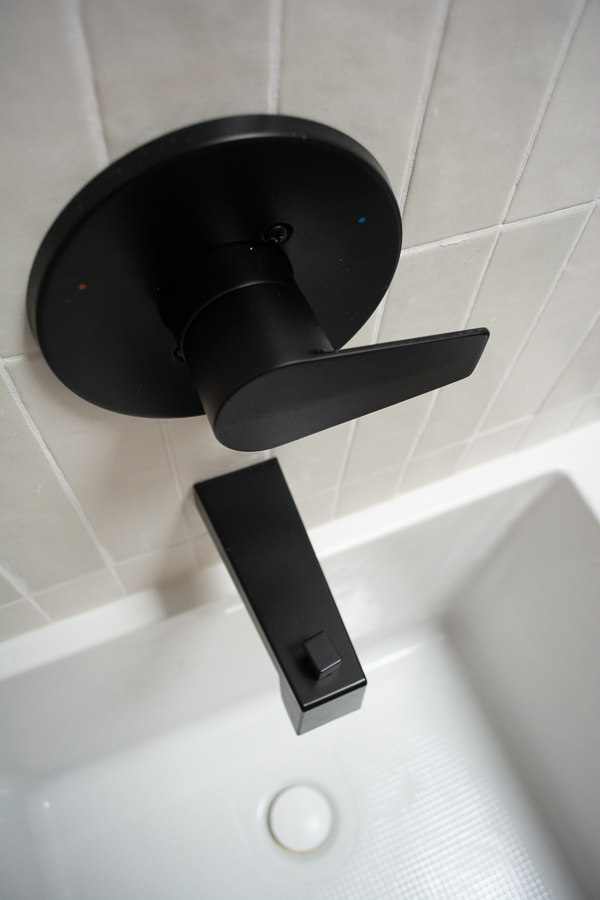
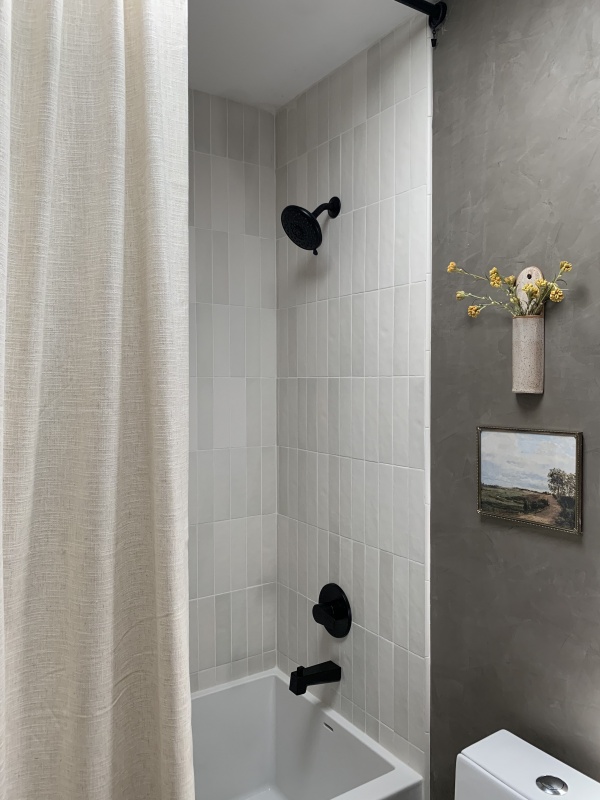
The tub we got is the Orchid Acrylic Alcove Tub from Signature Hardware. I love the flat panel on the front and it has a little ledge on the back where I know the kids will love to put all their toys.
It caused us a bit of a headache getting it in and I thought I was almost going to have to return it because it didn’t fit. But after getting a second plumber over, we made it work.
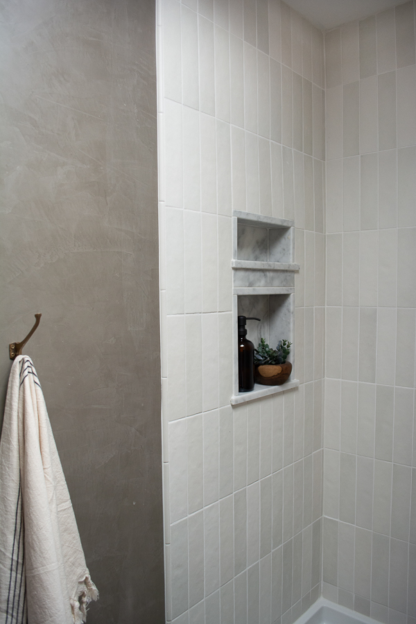
We used marble in the shower niche as well as for the base trim which was my FIL’s idea and I’m so glad he suggested it. I think it just ties everything together and is one of the details that can get easily overlooked.
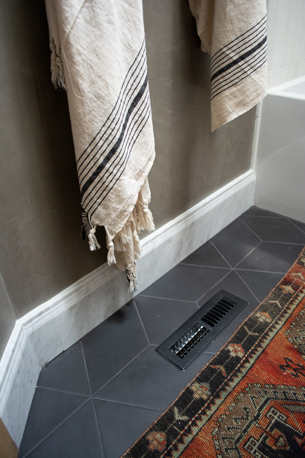
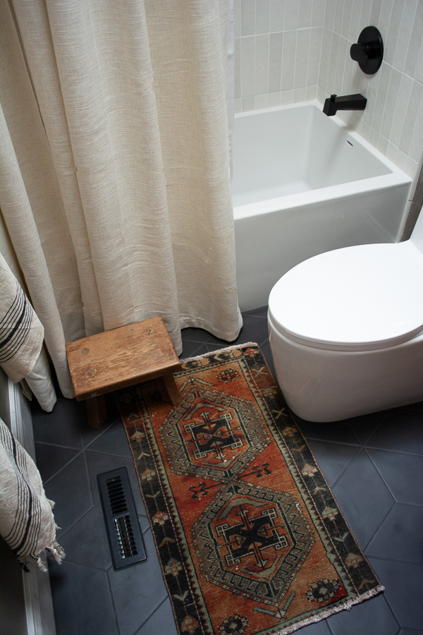
I’m in love with our floor tile. I got a lot of mixed opinions about how easy matte black floor tile with black grout is to keep clean – but I went for it. Since it’s such a small space I figured even if I have to clean it a little more often, it’s totally worth it!
It’s the Allora Floor and Wall Tile from Bedrosians and it’s just so pretty! I love how the dark floor grounds this whole space and the subtle but not too busy pattern adds some nice visual interest too.
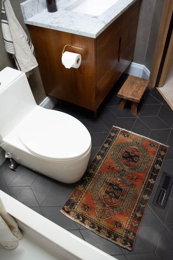
Of course I had to add a cutie little vintage rug in here which I found from ZDKilimPillow on Etsy. It’s the prefect size and adds a nice touch of color.
The very last thing that we need to do is get the pocket door hardware installed. We’ve had a really hard time finding a locksmith who will do it because of the brand I bought and the thickness of our door. Oops.
But I think I found someone who should be coming this week!
I shared more of the process of this door on my instagram, but I purchased this Solid Wood Door, added the vertical panels using MDF and painted it Tricorn Black. I also decided to paint the trim around the door at the very last minute :-p It’s color matched to the roman clay on the walls.
We finished this room but wouldn’t let the kiddos use it until after I took photos and they were dying to get in! They’re so in love with it (although Eloise is still disappointed I didn’t paint the walls pink ha).
I’ve always said bathrooms are one of my favorite rooms to design and I still feel that way after doing this one. It makes me smile every time I walk by and it’s been so fun seeing the kids finally enjoy it too.

BUDGET BREAKDOWN
Floor + Shower Tile: $865.38
Mirror: $248
Roman Clay: $94.75
Pocket Door: $225.21
Pocket Door Frame: $80.42
Pocket Door Soft Close Hinges: $110.15
Pocket Door Lock Hardware: $182.35
Grout, cement, backer board, marble base trim + niche: $720
Tub: $669 (gifted for brand collab)
Toilet: $449 (gifted for bran collab)
Vanity: $1799 (gifted for brand collab)
Faucet: $183 (gifted for brand collab)
Shower Fixtures: $155 (gifted for brand collab)
Light: $213.43
Vintage Print: $5.99 (already had frame)
Rug: $43.44
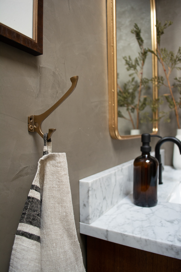
Wall Hooks: $26.70
Turkish Towels: $78.20 (4 pack)
Hand Towel: $31.09 (2 pack)
Vase/stems: already had
Ceramic Hanging Vase: $80.05
Curtains: $91.26
Curtain Liner: $18.22
Curtain Rod: $28.95
Soap Dispenser: $16.03
Nude Art Print: gifted
Toilet Paper Holder: $38.95
Vintage Stool: $20
Floor Vent: $12.54
Color Matched Paint for Switch Plate Covers: $23.12
Trips to Lowe’s for smaller random DIY tools/supplies: $250
$3,504.23
LABOR
Plumbing: $650
Electrical: $80
Drywall: $430
Pocket Door Install: $225
$1,385
TOTAL: $4,889.23
SHOP THE BATHROOM
Walls – Roman Clay from Portola Paints in the color Guru
Tub
Vanity
Toilet
Ceramic Hanging Vase
Vase on Vanity – HomeGoods
Faux Stems – Hobby Lobby
Turkish Towels
Stool – vintage from Mr. Darby’s
Vintage Rug
Marble Base Trim
Toilet Paper Holder





Kristen Pinnick
Gorgeous room! I have a question about the Roman Clay. Is that just a paint that goes on that looks like that, or is it a texture you apply and a color over it?
Thank you!
brepurposed
Hi! It’s a thicker material you apply with a putty knife and sand down to a smooth finish. You can read more about it here: http://www.portolapaints.com/products/roman-clay
Karen
Really nice .The wall treatment is grand , from my view it’s a little like elephant skin.
Norah
Beautiful result, Bre!
brepurposed
Thank you so much, Norah!
Sharon C
It’s absolutely beautiful Bre. What a huge transformation. I love the wall treatment and the color is just gorgeous.
brepurposed
Thank you Sharon!!! I love the walls so much!
Kris C.
Just beautiful! You have a wonderful eye for design and decorating. I especially love the cool amazing light fixture! I always love to see your projects around the house. And thanks for the links!
brepurposed
Thank you so much Kris! I truly appreciate that!
Brenda
Love every design element!! Brilliant!
brepurposed
Thank you so much Brenda!
Ajai Guyot
Love that you went with the darker color!!! It’s so moody and sophisticated ????
brepurposed
Ah thank you Ajai!! <3
Karen
Looks beautiful!!! I can’t believe how little your cost was for that whole project! All the DIY projects paid off!????????Great job, Bre!!????????????
brepurposed
Thank you so much Karen!!