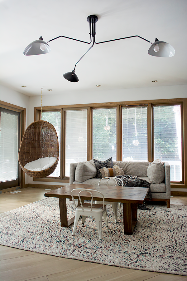
You may or may not know that the next room on our project list is….the kid’s playroom! I’ve been waiting patiently to update this space pretty much since we moved in over 3 years ago. So let’s talk plans!
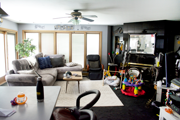
Let’s go wayyyy back to the beginning. When we moved in with my FIL of course I wasn’t going to immediately rip down all his decor. It took time and patience and has been a process. He’s been stubborn on some things but has also allowed me to do SO much which I’m very grateful for.
So here’s what it looked like when we first moved in and brought our couch, coffee table and rug with us. And allll of Eloise’s baby stuff.
Fast forward about 2 1/2 years later, my FIL was on board to replace all the flooring on the main level. He and his work partner installed about 12,000 sq. ft. of this gorgeous wood look tile from Marazzi.
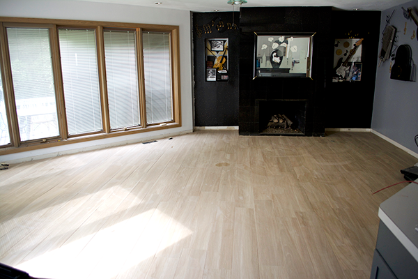
But a few weeks later I joined the One Room Challenge and focused on the other side of the main level – our family room and dining room. So this space became the kids play room and has looked pretty much like this ever since.
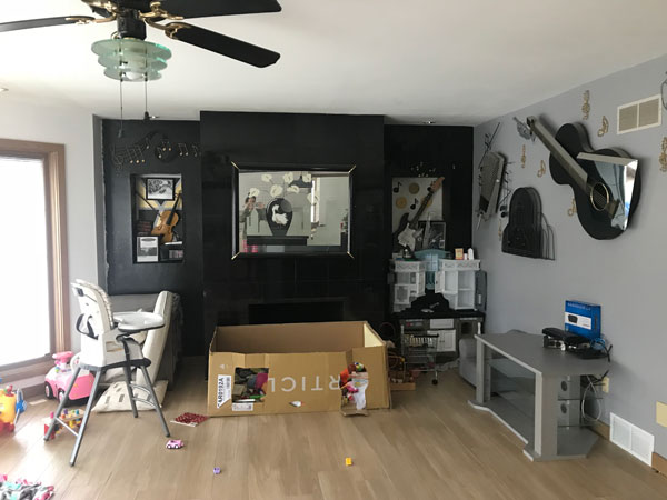
We made a few small improvements along the way like getting a new couch, rug, hanging chair and light. As well as building the kids a new table which turned out so awesome.

So now it’s time to focus on the fireplace and get those guitars off the wall 😉 My FIL finally gave me the ok to tackle this space so my head has been spinning with ideas ever since. I’m taking it slow because I want to do it right and just enjoy the process. But also I’m having a really hard time making decisions ha.
I’ve narrowed things down a bit and want to share with you guys a few different mock ups and get your opinion! I will ultimately do what feels right to me but I love hearing your input. And I ask that you please be kind – these mock ups are just a general design and of course will include lots of fun things for the kiddos once the space is done.
I was really hoping to cover up the cubbies on either side of the fireplace and do floating shelves or built ins of some kind but my FIL was adamant about keeping them. So we’re going to work with it!
THE FIREPLACE
This was what I wanted to decide on first because it would set the tone for the rest of the space. Since we did a darker concrete looking tile on our family room fireplace, I wanted to go light with this one. I’ve admired the venetian plaster look for a while and finally decided to go that route but in a DIY fashion of course.
Portola Paints has this finish called Roman Clay that produces the appearance of plaster but it’s a much easier process to apply.
Here are some samples of what it looks like.
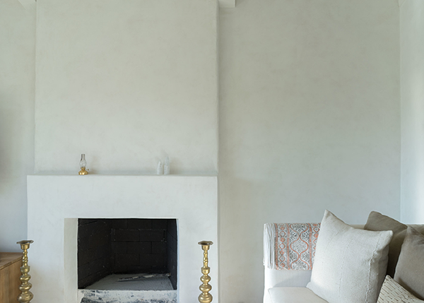
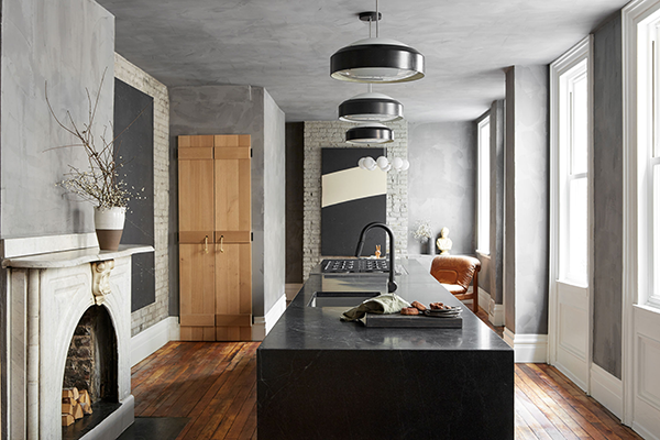 source: leanne ford
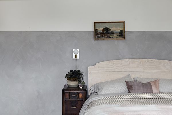 source: vestige home
As you can see it gives walls a subtle textured look which I LOVE. The main thing I need to figure out now is WHAT COLOR?! I ordered their sample color deck and know I want something off whitish, but there are so many variations of white!
We also need to figure out how to do this over tile, because it isn’t recommended, but we have some ideas that I will share once we get going 😉
THE BENCH
The one thing lacking in this room right now is storage. And it’s a playroom so we definitely need to address that. We’re currently using the box from our Article couch as the kid’s toy box #thanksdad Which has actually been great because it covers the fireplace opening.
But that’s gonna have to go haha. So my plan is to build an L bench that starts to the right of the fireplace and then continues along the entire adjacent wall. There will be some sort of custom cushion and then either drawers or cabinets below for alllll the toys. I love the idea of a cushion like this – maybe with a brass pole and some leather hooks?
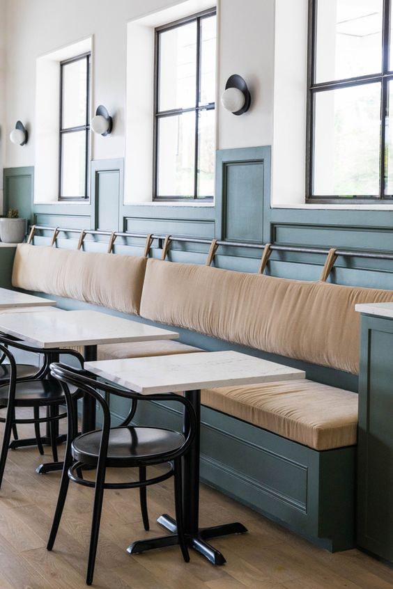 source: claire zinnecker design
ADDING COLOR
I’m currently trying to decide how to add some color to this space. Since our kitchen is so close by, I need to make sure it compliments our island color which is Astronomical by Behr. It’s a dark blue but can sometimes read with a green undertone. You’ll see below in my mock ups the different ways I’m thinking about incorporating another color. Most likely a dark green.
I also loooove a good wood slat treatment. I’ve been in love with it even before it became super popular so I know it’s something I won’t get tired of. I originally thought of potentially doing a wood slat fireplace but decided against it. So that’s another fun DIY element I’d like to bring in somehow!
We’re going without a mantel for now and I found some really cool hanging canvas quotes you can customize that I want to hang on the front of the fireplace.
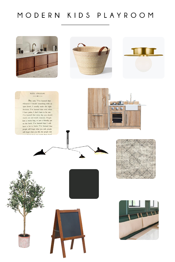
OK! So let’s get to the mock ups!
OPTION 1
Off white roman clay finish fireplace
Wood slat treatment on walls flanking the fireplace
Adjacent wall painted white
Light colored bench cushion
Dark painted cabinets below
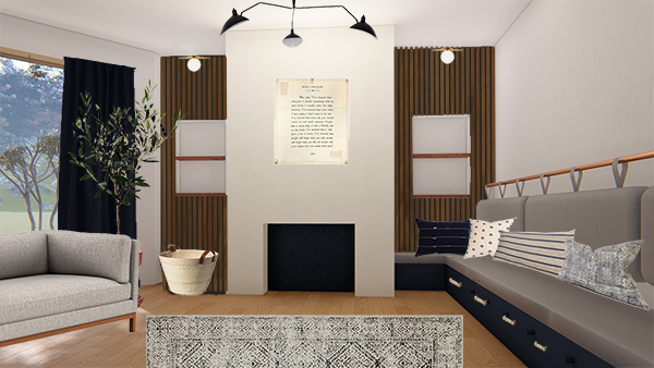
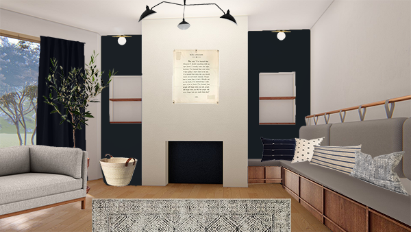
OPTION 2
Off white roman clay finish fireplace
Dark painted walls flanking the fireplace
Adjacent wall painted white
Light (or dark) bench cushion
Wood cabinets/drawers below
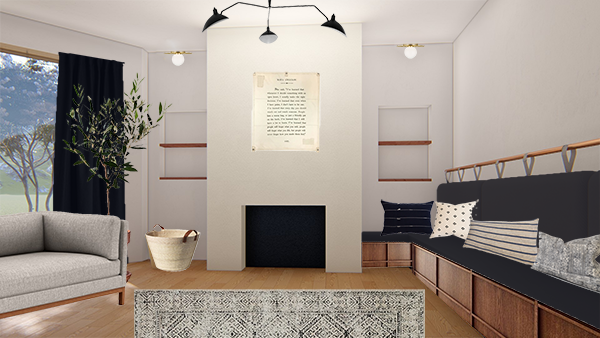
OPTION 3
Off white roman clay finish fireplace
White walls flanking the fireplace / continue roman clay finish
Adjacent wall painted white
Dark bench cushion
Wood cabinets/drawers below
OPTION 4
Off white roman clay finish fireplace
White walls flanking the fireplace / continue roman clay finish
Adjacent wall painted dark
Light bench cushion
Wood cabinets/drawers below
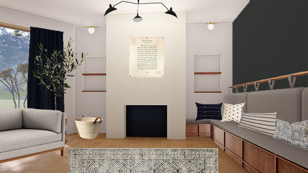
I honestly love them all so this is going to be SO hard! I think I’m leaning slightly toward option #2 right now but that could all change.
I’d love for you to cast your vote below and here your thoughts!




Ronnie
Your playroom looks great! Other rooms are well decorated as well. Actually, you gave me an idea to made a wooden doors for my kitchen storage. Thanks!
LA
They are all very good style-wise , but I think one huge thing is missing (or maybe it’s on another side of the room?) A couple of low open shelves for displaying a few toys. We (try to) do toy rotation, meaning that everything is hidden except a few toys, that get rotated. The storage under the bench is perfect for the hidden toys, but some are better left out to encourage independent play.
Cheryl
I like option 2 but use the darker cushion.
Katie Lucas
Ahhh it’s easy to see why you’re having a hard time deciding! Such fun options! @makingprettyspaces just shared a DIY bench similar to what you’re doing and it looked awesome. Can’t wait to follow along!
brepurposed
Thanks for the heads up – just went and checked it out! I wish the Besta’s fit our space but they’re too big. We’ll have to do totally custom but love how hers turned out!
chelsey heil
Love the texture of #1 but the colors of #2 – maybe do a painted wood slat treatment?
brepurposed
Funny you said that! I thought of that yesterday and am currently leaning in that direction 😉
Géraldine
That’s exactly what I was thinking ! 🙂
chelsey heil
Woohoo!!! Can’t wait to see it all come together – you will rock it!
Lesli Verellen
Hello! Could you put wood slats in the back wall of the cubbies so they blend in better? I love the color and material choices of option one ????
brepurposed
That could definitely be done!
Géraldine
I was thinking painted wood slats treatment flanking the fireplace and cubies painted the same color 🙂