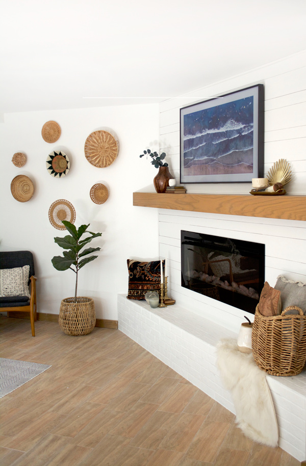
You guys got a peek at our simple and modern mantle makeover already when I shared our amazing new TV last week, but now it’s time for all the details! This was the last piece of our master suite renovation and I’m so happy that it’s finally done and we can fully enjoy everything.
This weird corner mantle seemed so awkward and a waste of space so we decided to build it out a bit while keeping things fairly simple to blend in with the rest of our decor. I’ve never had a real mantle to decorate before and I’m already looking forward to sprucing it up for the holidays 🙂
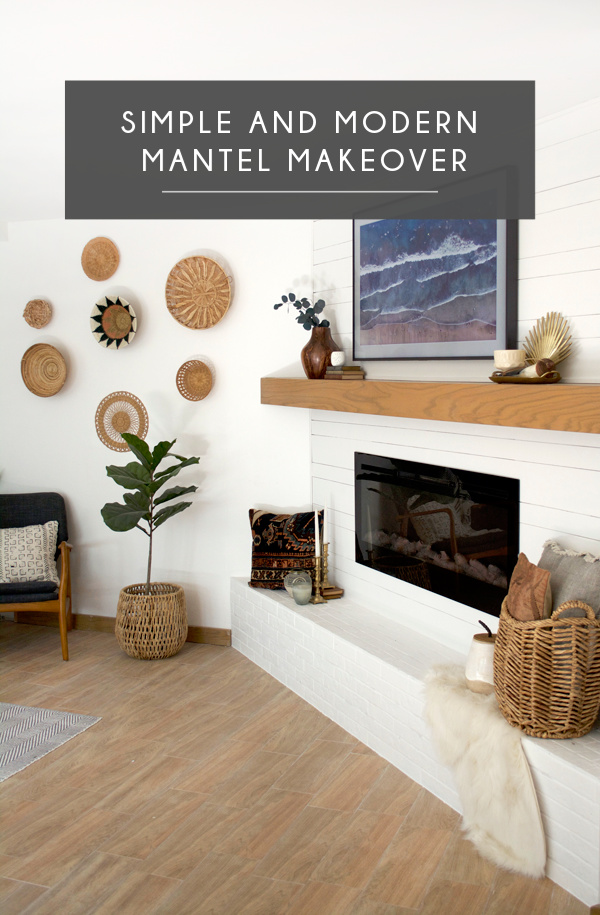
SIMPLE AND MODERN MANTEL MAKEOVER

Here’s a little refresher of what it looked like before (when we moved in):
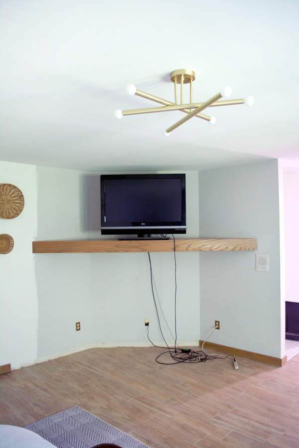
First things first was getting a new wall framed out. We called back our amazing contractor that we used on our bathroom reno and he got everything done in about 4 hours.
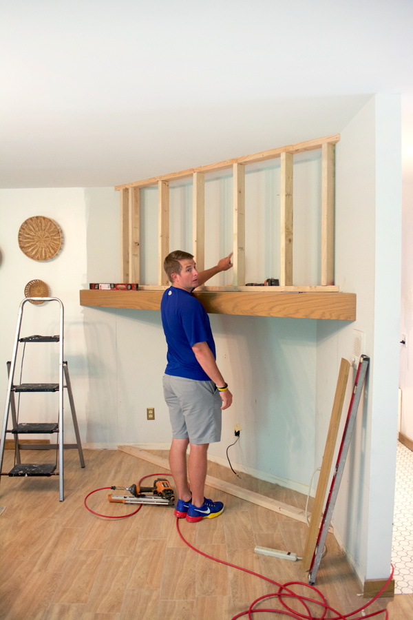
He built a frame up from the existing mantle, and a frame down as well as adding the little ledge on the bottom. Then we (Dan) hung up all the drywall.
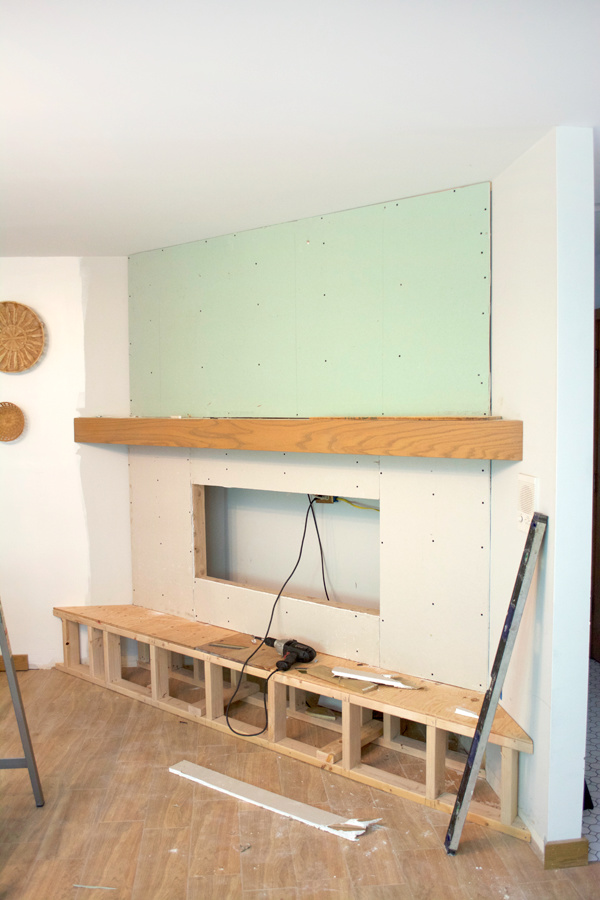
Once that was set it was time for the shiplap! I was really torn about what finishes I wanted on here. I know shiplap is totally overdone but it’s just so clean and classic and I’ve never actually used it anywhere in our home so I wanted to go for it. But I changed it up just a bit. I’ve had this idea for a while to do alternating plank sizes and I’m super happy with how it turned out.
We used 1/2″ plywood that we had cut into 6″ and 3″ strips.
Make sure your first plank is level and then work your way up. We started with the thicker planks on the bottom and went from there. We used nickels in between the planks as spacers and marked the studs along the way so we knew where to nail.
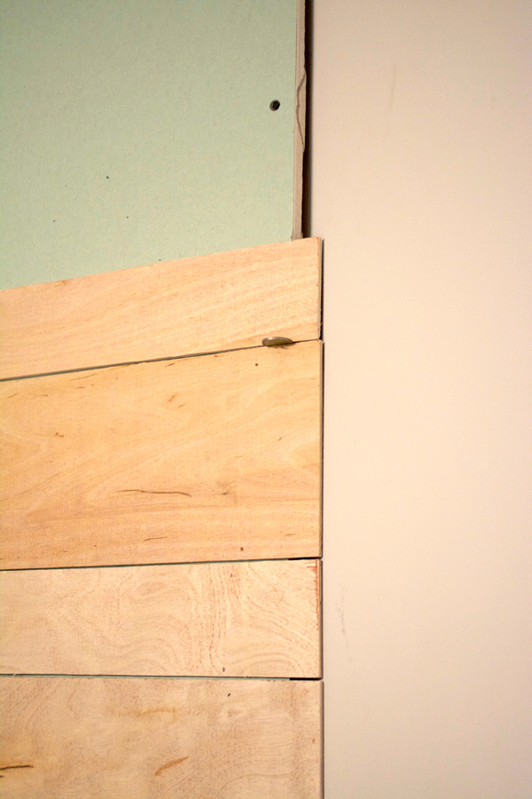
Since the plywood is so thin, we also put some PL-400 on the back to help secure it a little more.
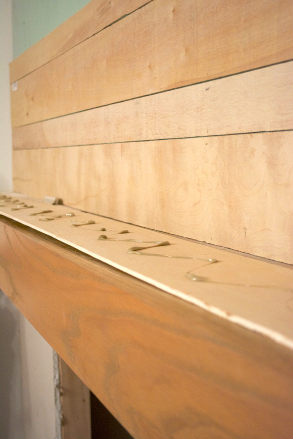
This is a pretty small area so it went quickly once we got started. We both liked the way the raw wood looked once we were done, but it was just too much wood.
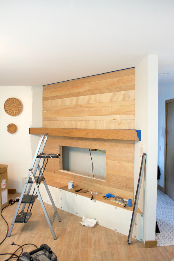
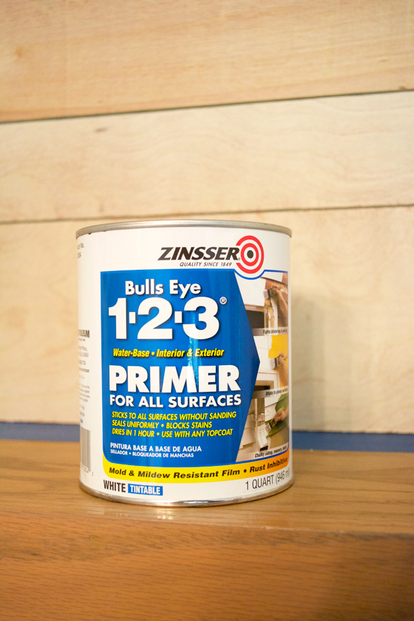
Once that was done, I apply one coat of primer and about 3 coats of paint. I used Zinsser Bulls Eye Primer and the same wall paint as in our bedroom – Valspar Reserve in Du Jour.
Next up was the tile (aka brick). We bought some brick look tile from our local tile guy that my FIL works with and then he installed it for us. He used a light grout so it would be easier to cover with the paint. THIS IS THE TILE WE BOUGHT and the color name is Warehouse BRX and they are 2×8.
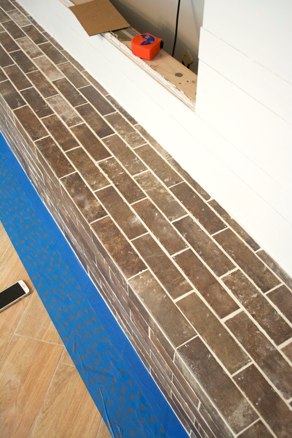
For the tile I did 1 coat of primer and only 1 coat of paint.
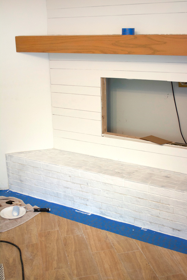
I wanted to leave a little variation underneath so it looked like actual painted brick, so one coat was perfect.
The last thing we added was some trim around the outside for a cleaner look.
THE FIREPLACE
Ok so now after all of the paint dried, we installed the fireplace first. I did some serious research on electric fireplaces. We thought about installing a gas one, but decided on electric in the end.
One thing I was surprised to find is that most mounted ones sit about 5″ off the wall which to me is just silly. The whole point of a mounted fireplace is to make it look streamlined into the wall right?
Luckily, I finally stumbled across ones that you could set into the wall as well, or as they’re called, recessed. We bought this electric fireplace from Touchstone Home Products and I couldn’t say enough good things about it.
It got great reviews, their customer service was on point. Can’t beat that. It was a little pricier than some of the other electric fireplaces I saw, but none of those ones allowed you to mount it into the wall.
TIP
If you are building out a new wall for a fireplace, make sure you have the fireplace first so you can measure exactly the size you need to frame.
As far as installation…this was insanely easy. There were a few screws on either side that you remove to take off the front glass panel. Then just set that aside somewhere safe.
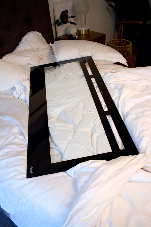
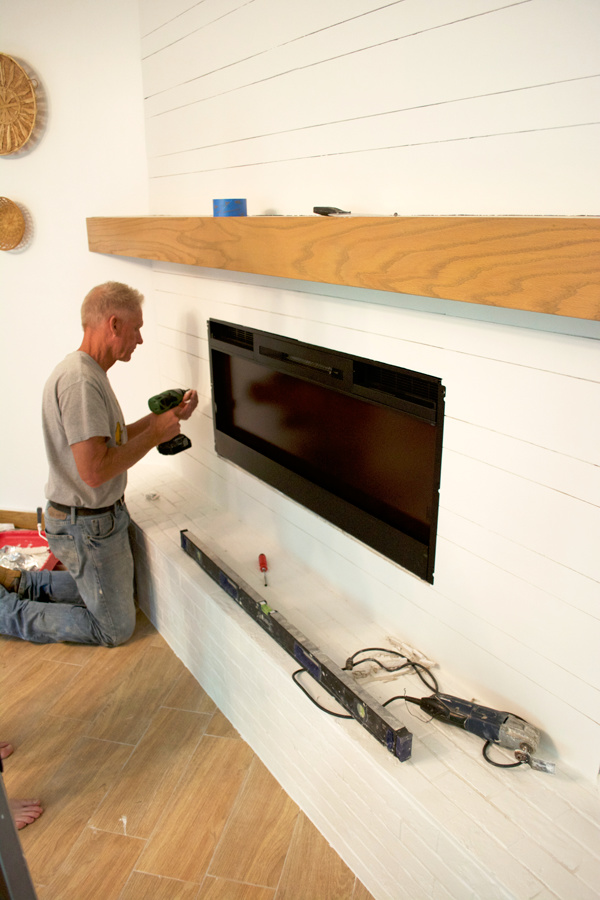
Then take the body of the fireplace and set it into your framed out hole. It comes with hardware and then you just screw it right into the wall. Then put the glass panel back over it and screw that back on. Easy peasy.
Lastly was our insanely amazing new Frame TV from Samsung.
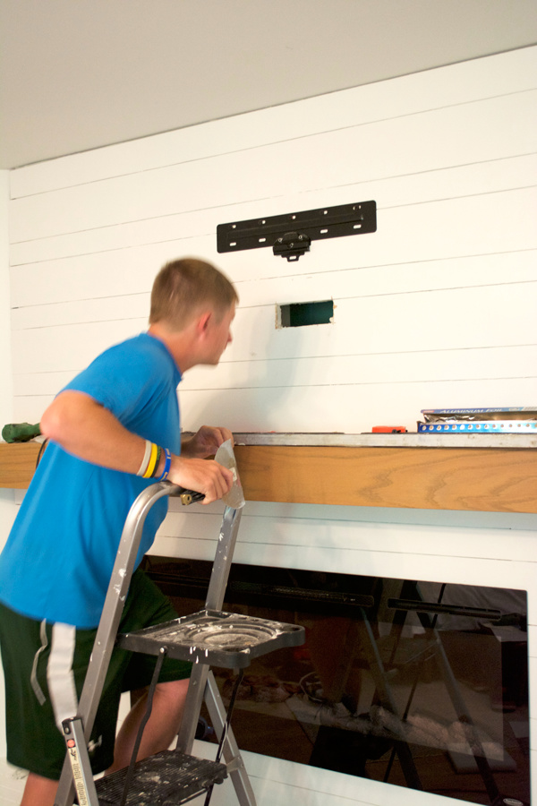
Basically we were able to put ALL THE CORDS in that hole we made in the middle to hide everything.
And once the TV was up – it was time to decorate!
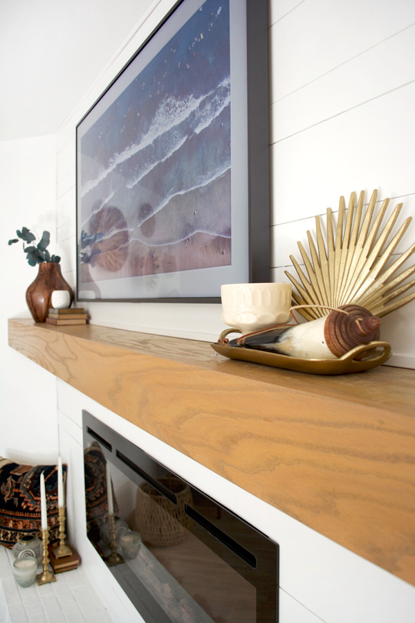
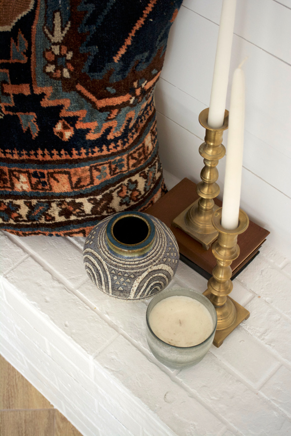
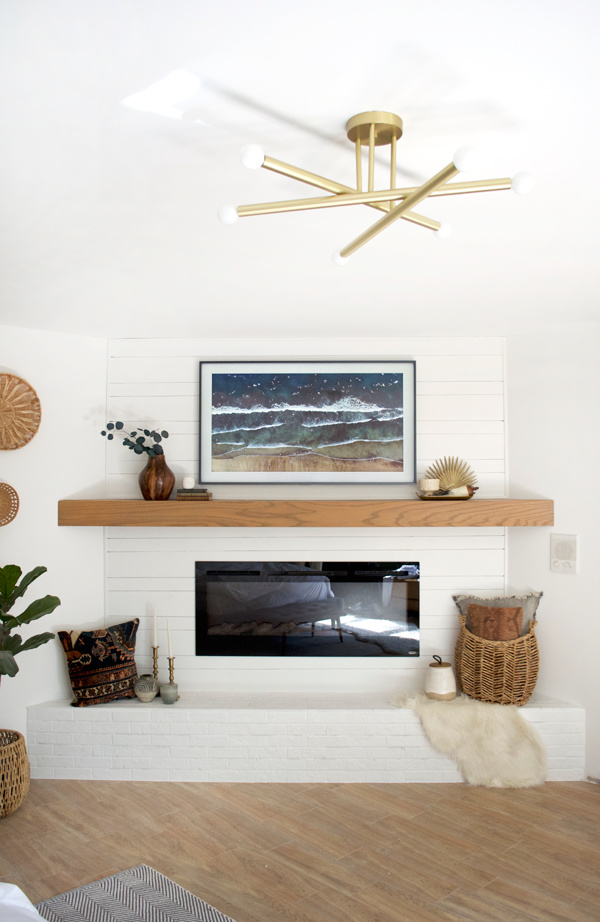
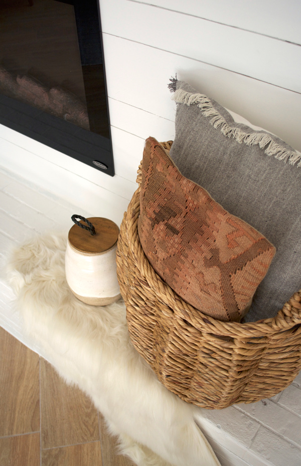
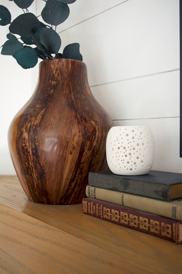

I’m sooo happy this simple and modern mantle makeover is finally done and our whole master suite is complete! We really have everything we need except a kitchen ha. I can’t wait to get that fireplace going once fall comes.




ANNA COUZENS
Gorgeous transformation. I’m loving that ceiling flush mount fixture, could you point me to the source?
brepurposed
It’s from lucent light shop!
Modus Fireplaces
Stunning, Thanks for the excellent outline
Adrian at ninjaDIY
Hey Bre, this is such a cool makeover. congrats …
I have to tell you though … I loved sooo much how that raw wood looked on that wall before you guys applied paint.
But after I’ve seen the rest of the accessories on the wall, the fireplace, the frame and all the other small pieces … I’m loving it, so cool !
Great article … great job !
colorninterior
Really great transformation, it is looking more mesmerizing than before. Well done.
Kelly Mahan
So well explained and amazing pictures! I’m impressed, the project looks awesome!
brepurposed
Thank you so much!
Robin Williams
Wow. This is awesome.I love painting. Wall decoration by basket is outstanding. Can you tell me where you found that gorgeous ceiling fan?
brepurposed
Thank you! It’s from Lucent Light Shop 🙂
Kelly
This looks fantastic! I love the painted shiplap and brick – it really makes the mantle pop 🙂
Best,
Kelly
brepurposed
Thank you so much, Kelly!
Karen
Amazing. Where is the ceiling light fixture from???
brepurposed
It’s from Lucent Light Shop!
Kristi
Oh my gosh Bre! It turned out SO perfectly!!! LOVE the mix of shiplap with brick and that TV overtop of it amazing!!!
JessiCa
Wow! Love how this turned out. You have really nailed the modern boho look in every space! Can you tell me where you found that gorgeous wood vase? ????
brepurposed
Thank you so much, Jessica! It’s from HomeGoods 🙂
yasmara
Did you move those outlets up higher so they are still usable? It looks great – like it was always there like that!
brepurposed
Thank you! We just moved the one on the right over and up – it’s hiding behind the basket right now!
Ardith
Wow, you guys did a fantastic job transforming this fireplace nook. The styling is perfection. This will undoubtedly make spending time with your new baby even more magical. Cheers, Ardith
brepurposed
Thank you so much, Ardith! Definitely looking forward to snuggling in here with our new babe!
Pat M.
It’s beautiful – just as is everything you’ve done to update this house. I just have a question – why was there a mantle on that wall when you moved in when there was no fireplace and anything else there? Was that some 80s thing??? :>) Good job and your followers are now green with envy.
brepurposed
Aw thank you Pat! And I have absolutely no idea! Such a weird thing to put there right?? The whole layout was just kind of weird!